Product Design | Branding
WHIMToday
/Daily news widget/
Product Design | Branding
/Daily news widget/
Imagine waking up and not needing to check your phone first thing. No unlocking, no switching between apps—just a single glance at your wall, and you already know the weather, your stock performance, today's meetings, and whether you need to leave early to beat traffic.
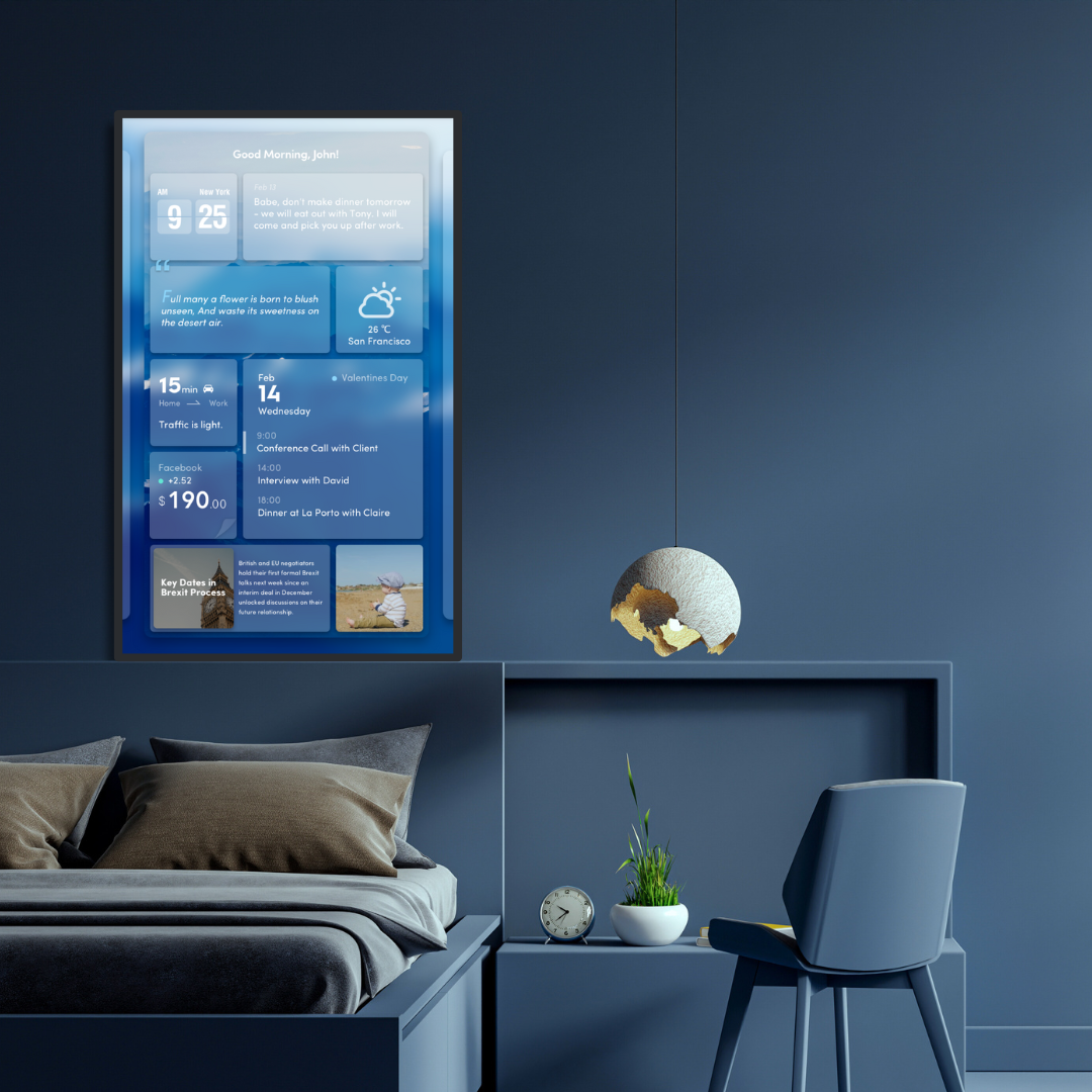
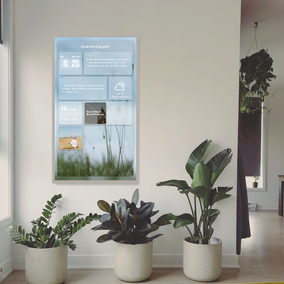
That was the vision behind WHIMToday, the home screen for Canvas—an ultra-thin, high-resolution digital display designed to blend seamlessly into high-end homes and office spaces. Unlike a tablet or a TV, Canvas wasn't a device you used—it was a window to the world, passively but intelligently surfacing the most relevant information, at the right time, in the right way.
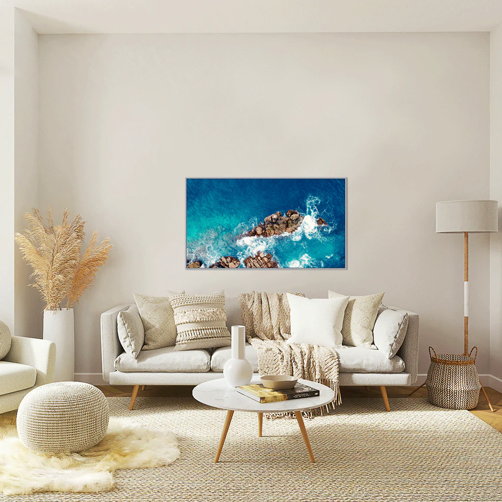
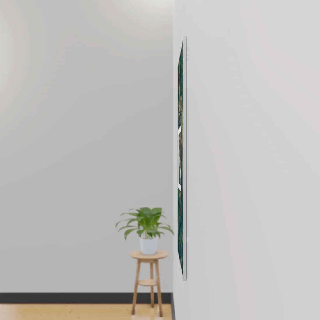
Who use canvas?
The task: Design a home screen that could surface essential daily information at a glance—weather, stocks, news, notifications, traffic, calendar, and even social media updates. No taps. No swipes. Just instant awareness.
This wasn't just about displaying data. It was about curation, hierarchy, and clarity. We had to take a firehose of information and distill it into a single, elegant, intuitive interface.
That led us to the next question: How do you fit the world into a single 1980x1080 screen?
If WHIMToday was going to be the first thing people saw every morning, it had to be perfect. It wasn't just another dashboard—it was an ambient, ever-present assistant that had to be:
But here's the real challenge: Information overload.
Canvas was pulling data from everywhere—news, finance, social media, personal calendars, notifications, and more. If we just dumped it all onto the screen, it would be chaos. Essentially, we have three challenges here:
Not everyone wants the same information. Some users wanted just the essentials—a clock, the weather, and a quick glance at their stock portfolio. Others wanted a full data dashboard, packed with notifications, news headlines, and real-time analytics.
The problem? Fixed widgets wouldn't work. A Wall Street analyst doesn't need the same dashboard as a yoga instructor.
WHIMToday needed a modular design that allowed users to choose what to surface—a system flexible enough to support both minimalists and information junkies.
Beyond what was displayed, users also cared deeply about how it looked. A nature lover waking up to a morning mist in the Alps wants a very different experience than a Wall Street analyst tracking pre-market fluctuations.
Now here's the tricky part: How do you design a UI that can carry every style?
Was that even possible?
A 1980×1080 display might sound big, but when you're fitting in weather, time, stocks, news, notifications, music, and traffic, real estate gets tight—fast. Every pixel had to work.
Instead of cramming everything in, we needed a design system that prioritized hierarchy and adaptability—knowing when to show what and when to stay out of the way.

You know that old joke about how to fit an elephant into a fridge? Well, for WHIMToday, we were designing a fridge that had to fit any animal you wanted, arrange them neatly, and still look elegant and functional.
Here's how we solved it:
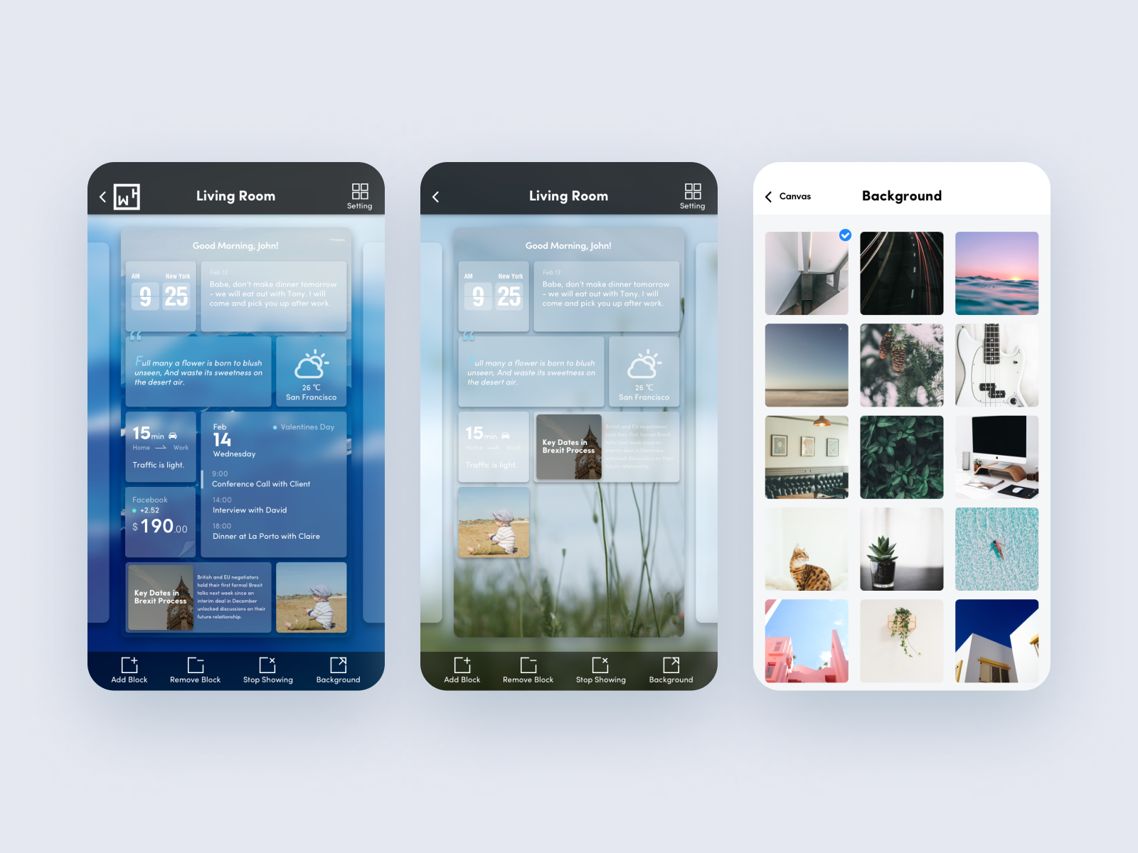
Each type of information—weather, stocks, news, calendar—lived inside a widget. Users could decide which widgets to place on their Canvas, customizing their dashboard to match their priorities. A stock trader could track market shifts at a glance, while someone else might only care about the weather and their Spotify playlist.
In 2020, Apple introduces widgets in iOS 14, allowing users to add, remove, and resize widgets for different apps. Something we had already built for WHIMToday back in 2017.
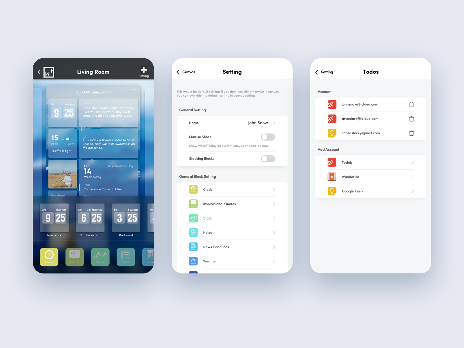
If you're into mixology, you know that vodka is a common base. Why? Because it doesn't overpower. It doesn't fight for attention. It just blends and let every other ingredient shine.
In WHIMToday's case, fixed colors and opinionated design wouldn't work. We need to find our vodka. And we found frosted glass.
Like vodka in a cocktail, it was neutral—subtle enough to let the user's personal style shine, but strong enough to unify the interface. It gave text just enough contrast to stay readable without blocking the background. It created a sense of depth, making the interface feel layered and sophisticated. It adapted instantly, whether your background was a forest, a cityscape, or your family photo.
Apple wouldn't introduce its frosted glass effect until iOS 14, but WHIMToday was already pioneering the approach in 2017.

Screen real estate was limited, but we realized something: a screen doesn't just exist in two dimensions. We could use z-depth and time to expand what it could show.
Each widget wasn't just a flat piece of information—it was a stack of cards. The top card displayed the most important data, while swiping or waiting would reveal more. For example, for stocks, we show your top holding first, but let you flip through other companies. For weather, we display your main city's weather, then rotate to the next city of your choice.
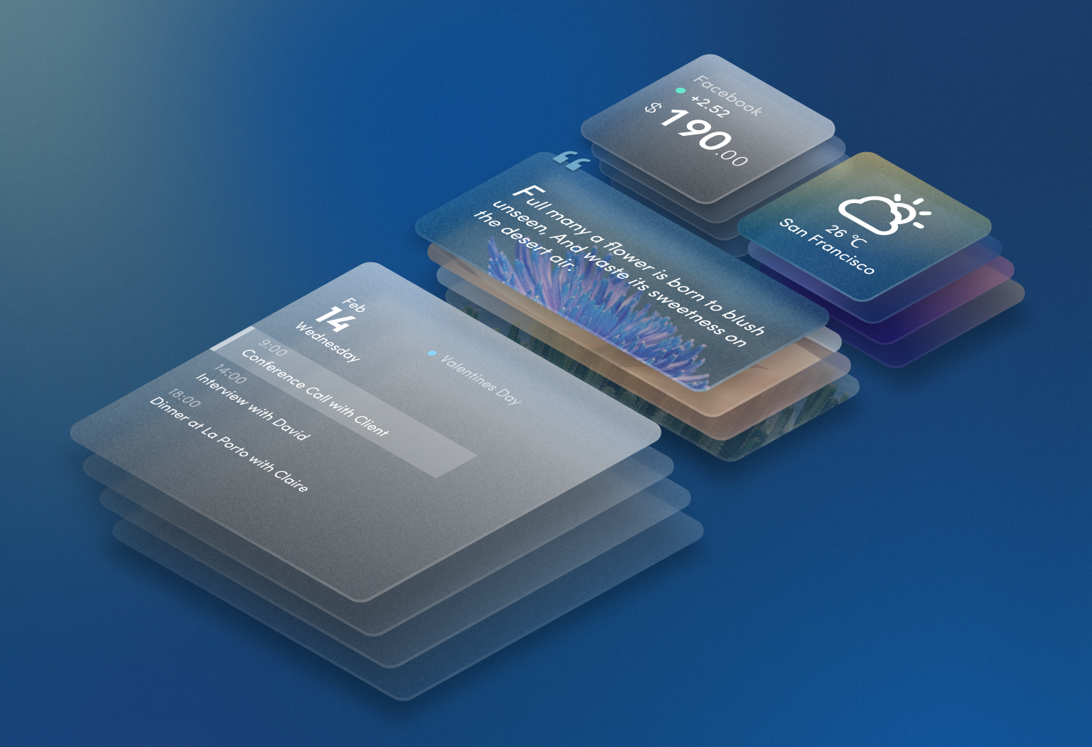
WHIMToday was a design that was three years ahead of its time. In 2020, Apple introduced widgets and frosted glass effects in iOS 14, but WHIMToday had already pioneered these concepts in 2017. It was not only a dashboard, but a vision of the future design trend.
Building WHIMToday wasn't just about solving a UI challenge—it was about designing for the future before the future had arrived. When Apple introduced both widgets and frosted glass in iOS 14 three years later, it was a clear validation: we had been on the right track.
Here's what I took away from the project:
When WHIMToday launched, it felt like it had always existed. The best interfaces don't feel invented—they feel discovered, like they were always meant to be that way. The moment WHIMToday became second nature to its users, we knew we had nailed it.
Some people want a sleek, minimalist time-and-weather display. Others want a data-rich dashboard of stocks, traffic, and breaking news. WHIMToday's modular approach taught me that the best products don't assume they know what the user wants—they adapt. The power of customization isn't about offering more options; it's about making the product customizable to every user.
When we chose frosted glass as the foundation of the UI, it wasn't because it was trendy. It was because it was timeless. Like vodka in a cocktail, it blended seamlessly with any background, any aesthetic. The lesson? Design choices should be driven by function and flexibility, not just what's popular at the moment. Trends fade. Adaptability lasts.
Three years after WHIMToday launched, Apple introduced widgets and matte glass in iOS 14. Seeing the same design language we pioneered become the norm across millions of devices? That's the kind of validation you can't plan for—but when it happens, you know you were designing in the right direction.
In the end, WHIMToday wasn't just ahead of its time—it was a glimpse into where UI design was going. And that's the best kind of design work: when you build something for today that ends up defining tomorrow.
- end -