Product Design
MUJI Concept
/MUJI mobile retail website/
Product Design
/MUJI mobile retail website/
I love MUJI. You love MUJI. Who doesn't love MUJI? The brand's whole vibe is about effortless minimalism—no frills, no excess, just simple, beautifully designed products. Everything they make, from pens to bean bags to USB fans, feels intentional. Clean. Thoughtful.
And then there's their website.
The moment I landed on it, I felt… betrayed. It was like stepping into a MUJI store, expecting that signature zen atmosphere—only to find yourself in a messy warehouse with flickering fluorescent lights.
MUJI's physical stores give you a calm, seamless shopping experience. Their website? The opposite. And that's when I knew: this needed a redesign. The problems are glaring:
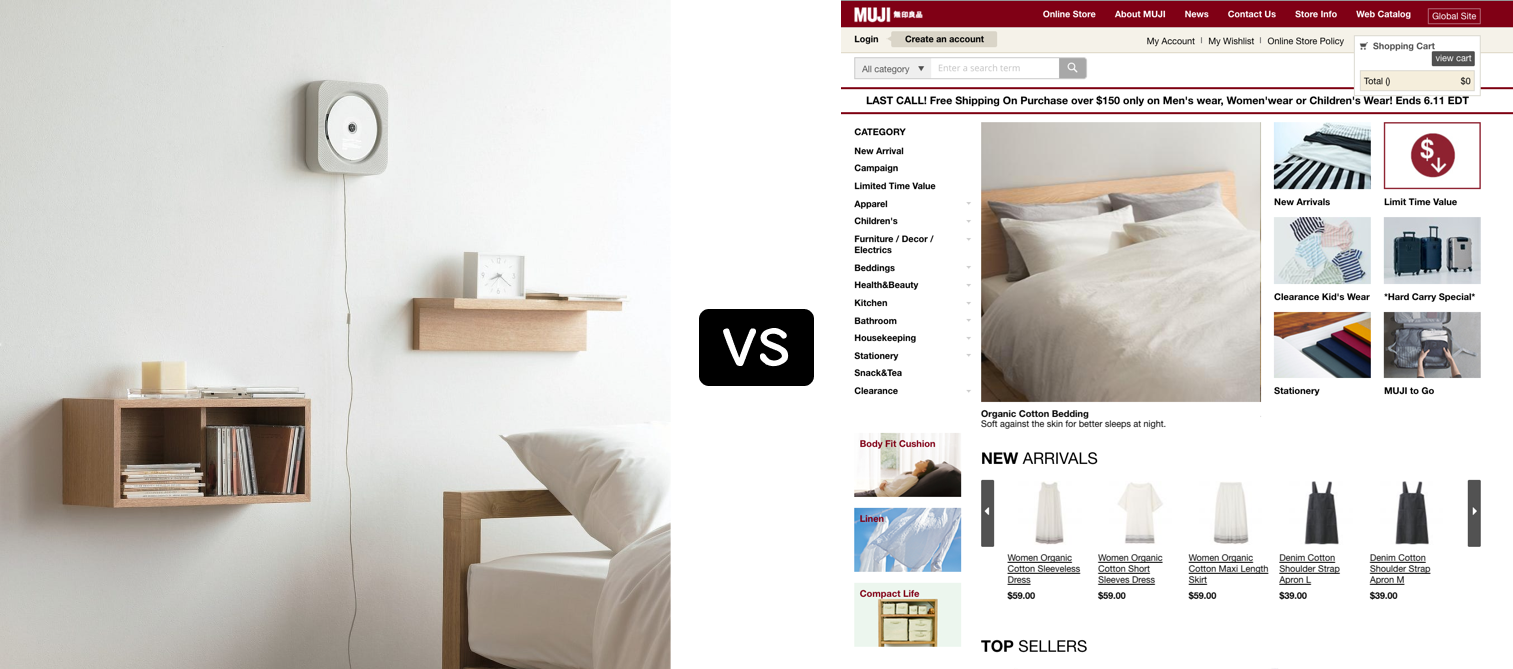
Let's make this real. Meet Emily.

Emily and her roommate go shopping at the MUJI store on 5th Avenue. She's been eyeing a bean bag for weeks, and today is finally the day. She asks a staff member if they have the pink one in stock. The answer? Bean bag yes, but only in gray.
The staff suggests she order the pink cover online. So she pulls out her phone, opens MUJI's website, and… instantly regrets it.
In this scenario, Emily:
In this moment, what Emily needs is:
A redesign isn't just about making things prettier—it's about making them work and actually helping Emily (actually, me) out. Here's the plan:
If everything is important, nothing is. We needed to prioritize.
MUJI is minimalist. The website should be too.
No more "fake responsiveness."
Their branding is about calm, simplicity, and clarity. The site should reflect that.
MUJI's design philosophy is rooted in Japanese aesthetics—subtle, refined, and deeply intentional. Their packaging is simple. Their stores are serene. Their products have a quiet elegance.
So I asked myself: How do you translate that into pixels?
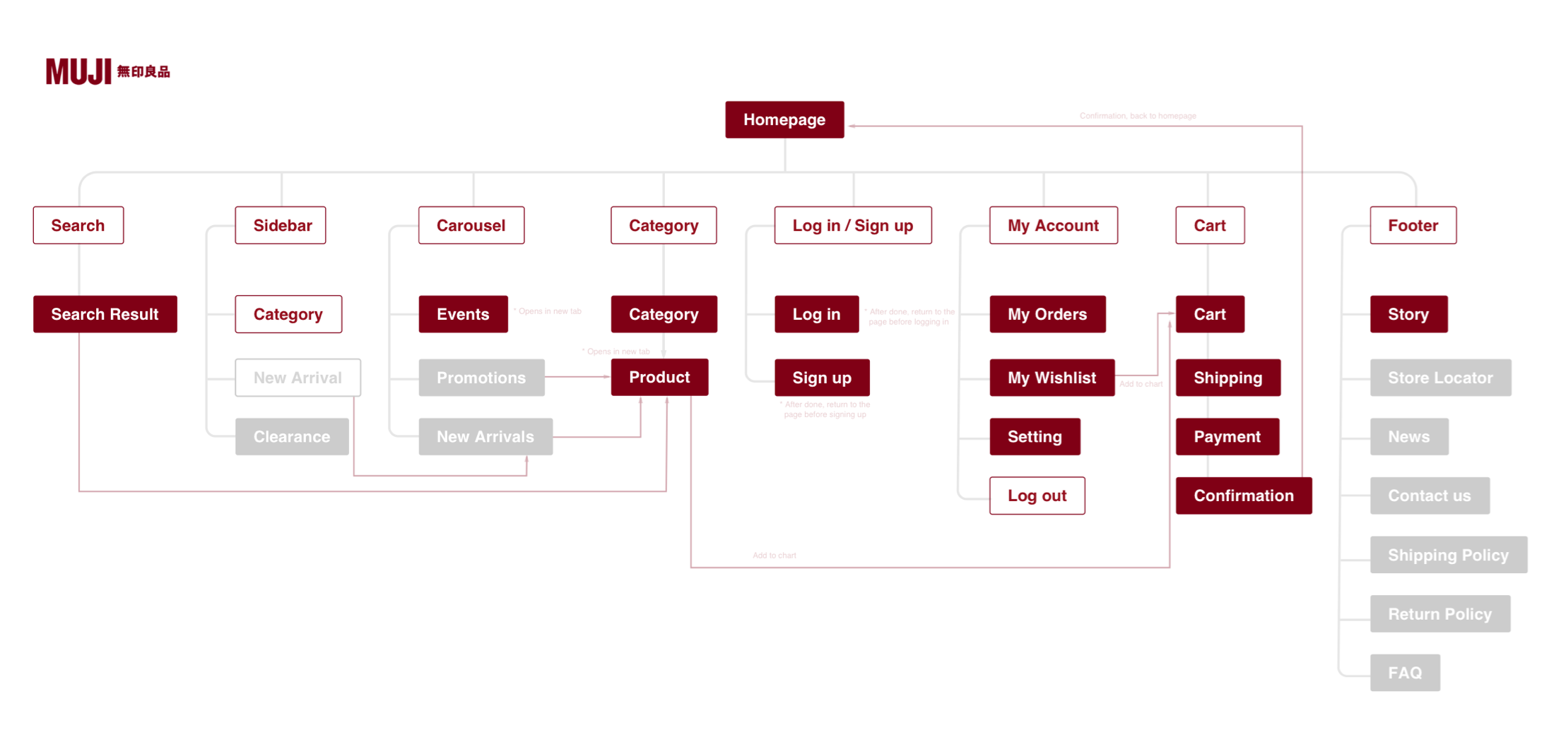
Before everything, I mapped out the userflow across the whole site. This helped ensure that every section had a purpose.
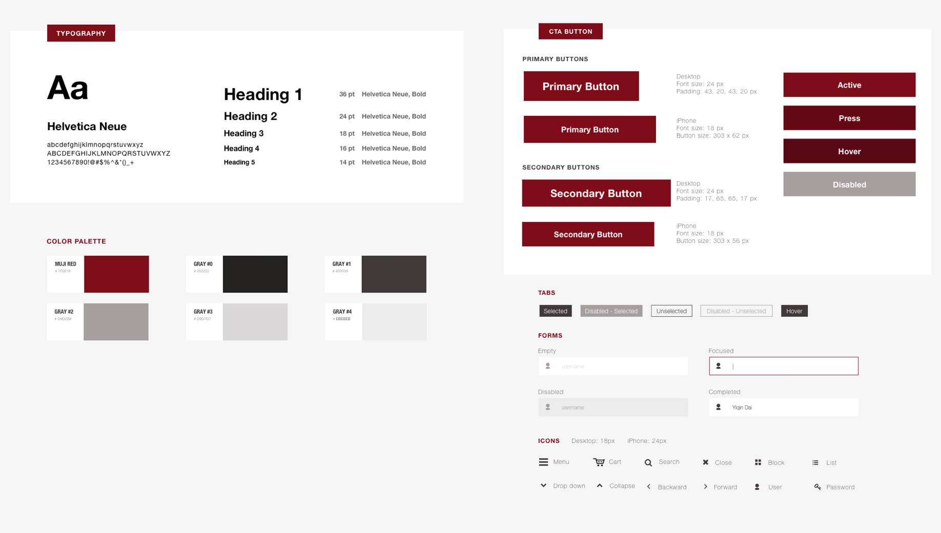
MUJI's red isn't bright or flashy—it's warm and muted. So instead of stark black-and-white contrast, I toned the grayscale with a hint of red. This kept things feeling warm and organic.
For the font, I picked the old, bland Helvetica Neue. Yikes. Boring, right?
Not quite.
Helvetica is just like MUJI—modern, humane, bland, even boring at first glance. But also timeless. And not just timeless, but stable, humble, and practical. This wasn’t about picking a trendy font. It was about picking the font that tells the brand's personality.
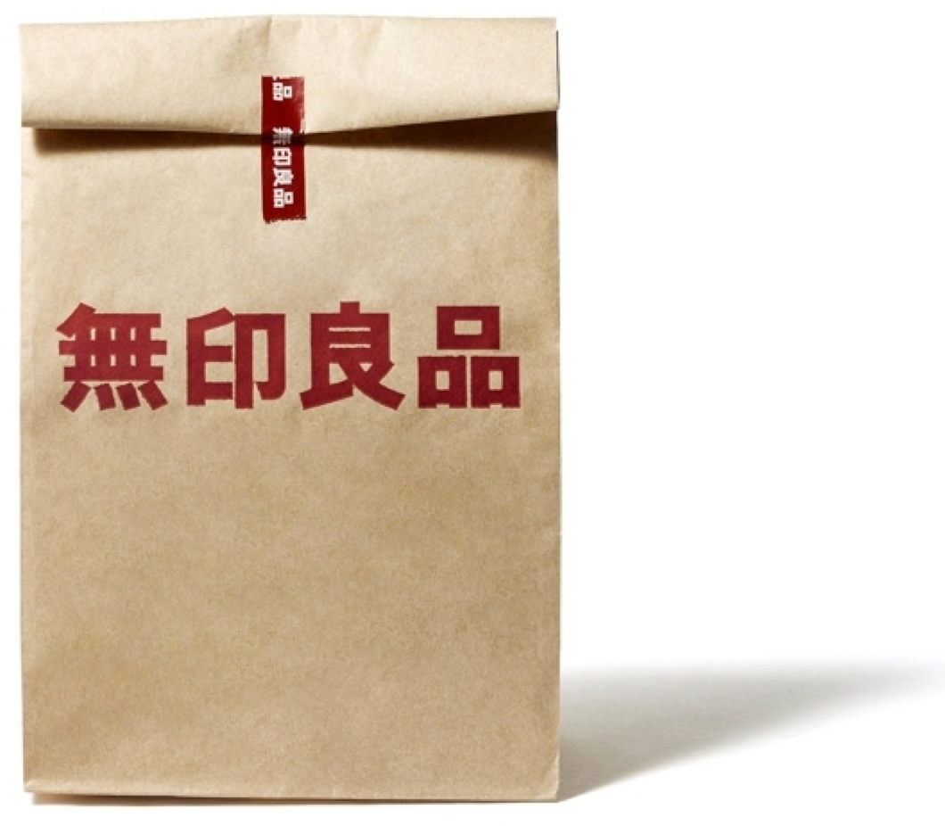
At first, I thought: Hey, MUJI loves natural materials. What if I add a subtle paper texture to the background?
Terrible idea. The site immediately looked muddy, not clean. It felt more like an old newspaper than a modern website.
Then it hit me: In the digital world, white space is the equivalent of paper.
MUJI's real-world products use empty space to create tranquility. So instead of adding a paper texture, I leaned into white space. This is where the design breathes.
The final design was everything I wanted it to be—clean, functional, and unmistakably MUJI. No frills, no distractions. Just clarity and quiet sophistication, the way MUJI itself approaches design.
And it wasn't just me who thought so.
This case study became my golden ticket into Toptal, a network that prides itself on hiring the top 3% of designers—usually seasoned professionals with a decade of experience. At the time, I had been designing for only a couple of months. But when I presented this, my interviewer was blown away. She stayed silent throughout my entire 30-minute presentation. By the end, she said, “You’ve obviously nailed it. I can actually learn a lot from this case study!”—and just like that, I was accepted on the spot.
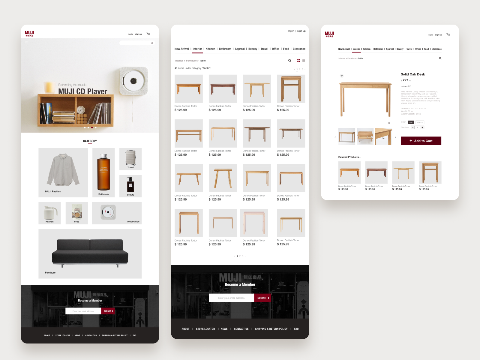
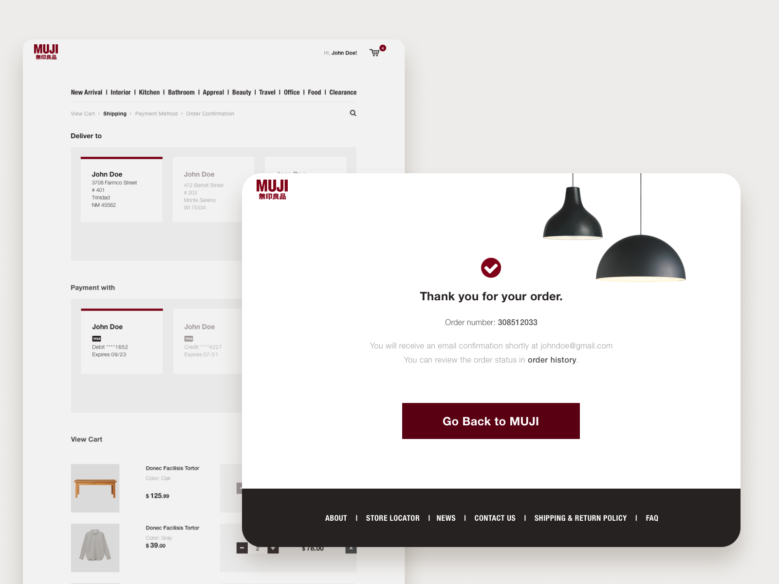
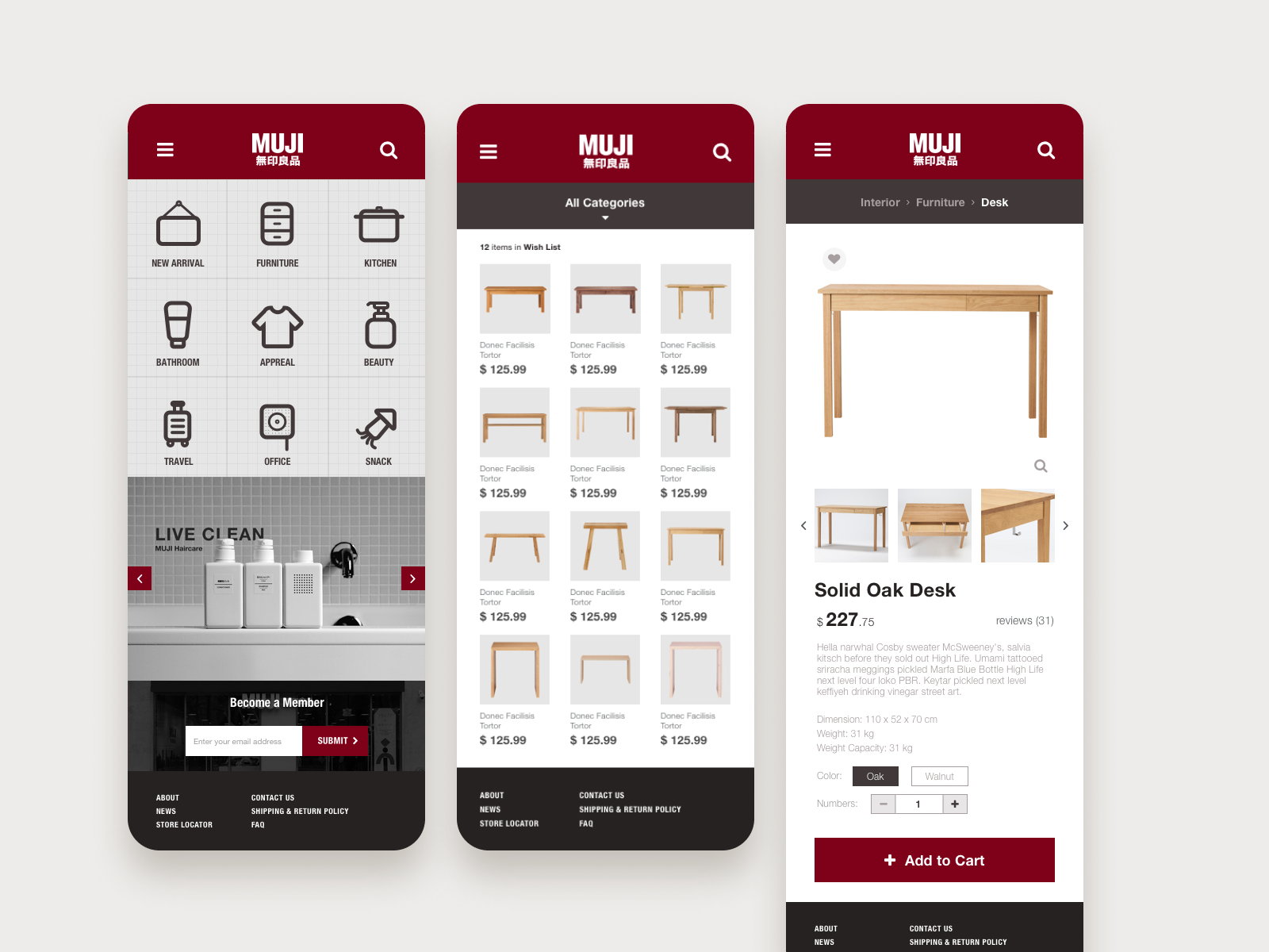

This wasn't just a UI project—it was proof that good design isn't about flashy trends, but about deeply understanding a brand's DNA and translating it into pixels.
- end -